


TL;DR
-
Google's mobile-first index has rolled out, prioritizing mobile-friendly websites.
-
Your layout doesn't have to be the same to benefit, but mobile and desktop users will need access to the same page content.
-
If you still have a separate 'mobi' website, this is your last chance to make a single, responsive site instead.
Back at Pubcon in 2016, Google’s Gary Illyes announced the search engine’s plans to switch to a mobile-first index, which would prioritize websites in rankings based on suitability for use on mobile devices whether the results are appearing on mobile devices or not.
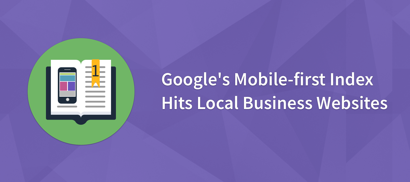
Now, I hope you’ve spent part of the last two years optimizing your local business site for mobile, because after a slow rollout for major sites, Google’s mobile-first index has finally hit smaller, local business websites. This became particularly apparent when SEO Twitter blew up with tweets like the one below:
Mobile first indexing rolling out in a huge batch right now. See my inbox:#google #mobilefirst #SEO pic.twitter.com/rOH7SEtSEU
— Joost de Valk (@jdevalk) 3 July 2018
While this has already been rolling out slowly in smaller batches, the glut of notifications in SEO agency and webmaster inboxes suggests that this is the biggest batch yet.
Google have been characteristically vague about the rollout, stating up until now that they were waiting for a point at which the switch wouldn’t result in drastically different search results (what Gary Illyes referred to as “quality neutral”).
At the same time, it’s very likely that Google didn’t want major online players to suffer due to the mobile-first ranking. For example, if eBay and Amazon had less-than-stellar mobile responsiveness, their sites would be less likely to appear top in search rankings.
This would lead to major headaches for Google, as it would result in a search experience that’s noticeably different, something that Big G generally tries to avoid.
What does the rollout of the Mobile-first Index mean for you?
Ultimately, this means that sites that aren’t delivering the same content on mobile and desktop will suffer. (Note that this doesn’t mean ‘the same layout’ – Google wants users on mobile and desktop to have access to the same content, it doesn’t necessarily need the experiences to look the same.)
Those of you with mobile-responsive sites shouldn’t see an impact, but anyone with a separate ‘mobi’ site redirected to from the desktop version certainly will.
Unlike a lot of Google’s switches and rollouts, this change came with two years’ warning, so webmasters have had a great deal of time to pull their heads out of the sand and get their sites mobile-ready.
If you still haven’t, consider this a last warning: your site is going to significantly slip in the rankings unless you get a mobile-responsive version of your site published, and pronto.
A minimum requirement is to test your site using Google’s Mobile-Friendly Test.
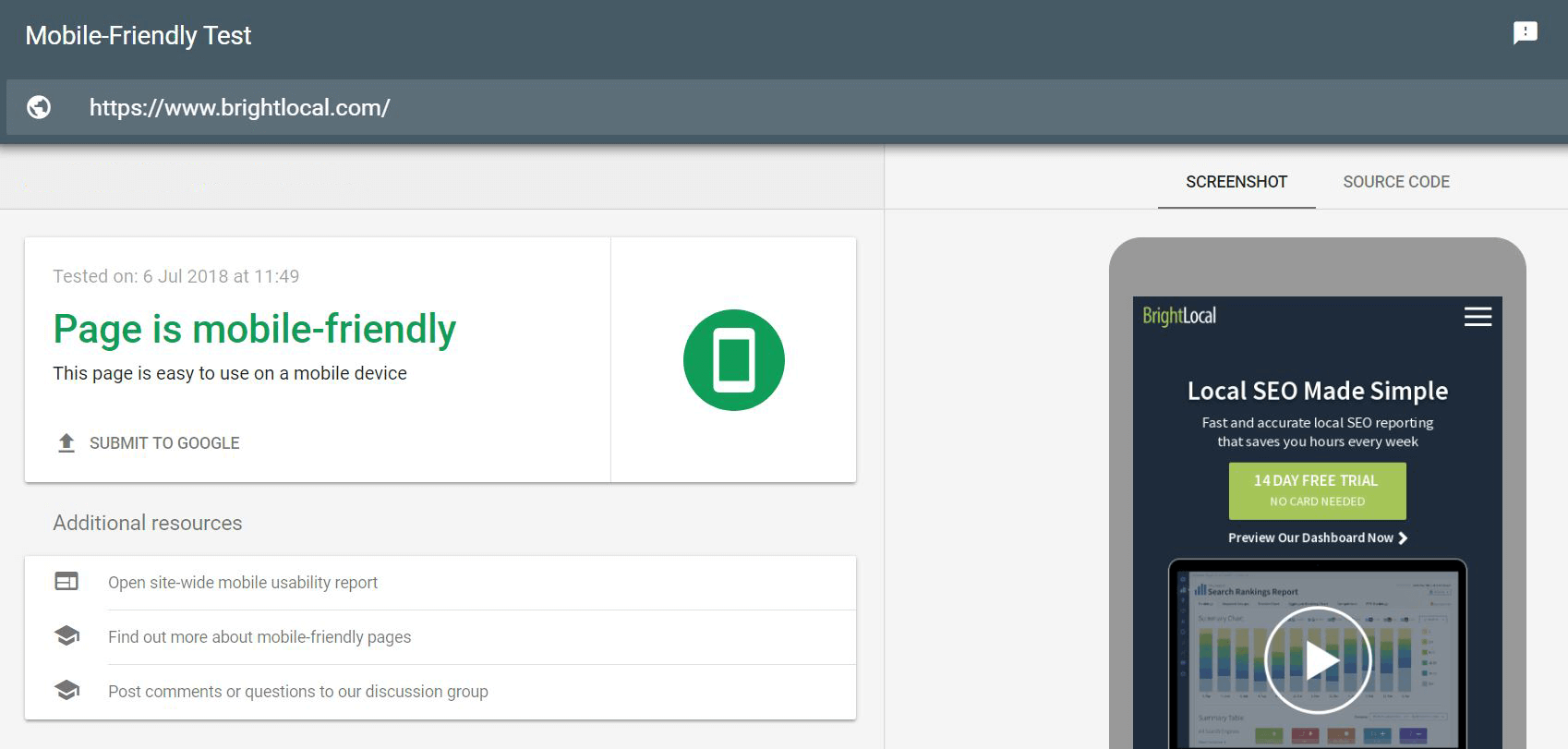
If it passes, great, but put those laurels away – you should only rest when you’re confident you’ve fully considered and acted on the below.
5 Things to Consider for a Mobile-friendly Website
User experience
Experiences on desktop and mobile couldn’t be more different. Not only are the sizes and orientations dissimilar, but the way users navigate them is, too
All Google needs to see to surmise that the mobile experience is worse is a change in time spent on pages when viewed on mobile, along with reductions in traffic between pages.
Mobile-friendly text spacing
With a smaller screens comes far less real estate for text and copy. That large chunk of text might be easy enough to read on desktop, but take it to mobile and it fills the screen and becomes very hard to follow. This is why you’ve probably seen websites with line breaks every other sentence.
The flowery wordsmith in me kind of resents the mass move away from longer sentences, but this is the world we live in now, so keep your text short, to the point, and broken up in a way that’s easier to read on mobile.
(The flowery wordsmith in me is rather placated when I remind him that ‘Hey, now it’s more like a poem!’)
Mobile-friendly fonts
Following on from the above, your site needs to display text in a font that’s easy to read on a mobile device. Visitors shouldn’t need to zoom in awkwardly in order to read what you’ve written, so configure a viewport for to make sure your fonts are rendered to correct sizes on different device screens.
In the meantime, using font size 14 at a minimum across your site should save you (and your users) a lot of headaches.
Mobile parity
For Google to consider your site fully mobile-friendly, it wants to see the same content (and links!) on both mobile and desktop. This is what Yoast calls ‘mobile parity’. This can be hard to pull off if, in order to make your site responsive, you’ve had to hide or redirect certain parts of your layout, but with a bit of work it can be done.
Take a look at Yoast’s article on mobile parity to make sure that you’re executing mobile-responsiveness in a way that’s going to satiate the gods at Google.
Always be testing
So you know I said you could rest after you’d considered and acted on these five points? Please accept my apologies for that little white lie.
As with everything digital, you need to be continually testing. Especially for those with larger sites with content produced and published on a regular basis, you’re going to come up against edge cases; unique pages that just don’t translate well to mobile.
Whether you’re dealing with a complex table, a large image, or just a whole ton of content that’s hard to navigate, in order for that page to rank in the mobile-first world you need a solution that’s going to present the same content to both desktop and mobile users in a way that doesn’t compromise the mobile experience.
Has your site been affected by the mobile-first index?
It’s still early days, as this large batch of mobile-first indexing only got rolled out this week, but let us know if you’ve noticed any large changes in mobile rankings and traffic recently.
For an easy way to check local rankings for multiple location sites, on mobile and desktop, check out BrightLocal’s Local Rank Tracker tool.