


In the last few years, there has been a dramatic increase in the number of searches conducted on mobile devices. According to recent studies, 64% of all searches are now conducted on mobile devices and I’m sure this number will continue to grow.
With the majority of viable consumers having access to smartphones, it’s more important than ever for local businesses to optimize their websites for mobile. Not only is it important from a search engine optimization standpoint, but making a website mobile-friendly also provides a better user experience for your client’s customers.
In this guide, we will discuss all aspects of mobile optimization, from making your clients’ websites mobile-friendly for search engines, to improving the user experience. We’ll also cover some common mistakes to avoid and provide tips for optimizing sites for local SEO. Let’s get started!
Why Local Businesses Need Mobile Optimization
Mobile optimization is the process of making a client’s website easy to use on mobile devices. This includes everything from making sure the website loads quickly on a mobile connection to ensuring that the content is easy to read and navigate on a small screen.
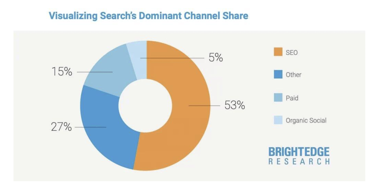
Optimizing a website for mobile helps improve its search engine rankings, which is crucial since search is by far the main driver of traffic to business websites.
Plus, it also makes it more likely that people will actually use the site when they find it.
Take Reliable Couriers as an example. They are located in various cities, so they need their site to be optimized for local keywords with location-specific pages and local backlinks. That way, if anyone uses the search term reliable courier services near me , their business will show up high in the SERPs, driving targeted prospects at scale.
Organic traffic from search engines can lead to more conversions. If you’re not optimizing your client’s sites for mobile, they may be losing out on potential customers.
Here are a few key reasons why local businesses need to focus on mobile optimization:
- Google penalizes websites that aren’t mobile-friendly.
- More people are using mobile devices to search for local companies.
- Optimizing for mobile provides a better user experience for your customers.
Mobile SEO Guide for Local Businesses
In order to impress Google’s search algorithm, the website needs to be optimized for mobile. If clients don’t have a mobile-friendly website, then chances are Google will stop ranking them on search results.
Follow these 8 tips to ensure all of your client sites meet Google’s expectations for mobile web design:
1. Check if the Website is Mobile-friendly
The first step is to check if the website is already mobile-friendly. You can do this by using Google’s Mobile-Friendly Test tool. Simply enter the website’s URL, and Google will analyze the site and tell you if it passes its test by giving you a giant green tick.

If your site doesn’t pass, don’t worry! There are plenty of things you can do to improve it.
Luckily, in 2022 most web page builders create pages to look good no matter where they’re viewed. Take your time to research and find products such as a landing page platform that best fits your needs for your mobile visitors.
Plus, every serious web design company today builds websites to be mobile-friendly as standard — often following “mobile-first” design principles. However, if you outsource this task, make sure that previous sites in their portfolio look good on mobile before hiring anyone to create a site on your behalf.
If you build your clients’ websites for them or are updating an existing site, check the help section of the website builder to see how to enable a responsive design for the site. In many cases, replacing the theme or template with a responsive one is the easiest way to achieve this.
There are a lot of options to create a code-free website nowadays. However, when using a drag and drop website builder, you need to ensure they provide an optimal viewing experience for desktop, mobile, and tablets. Creating a new website is a cost-efficient way to gain an online presence for a small business.
Many online resources offer high-quality assets such as vector graphics , videos, and photos. Don’t forget to optimize the icons and images you use on websites for mobile. Make sure they’re the right dimensions, that the file size isn’t too large, and they look good on every device. Luckily, many content management systems, like WordPress, offer built-in responsive images — a feature where your website automatically delivers smaller photos to users using mobile browsers.
2. Improve Your Site’s Load Time With Google PageSpeed Insights
One essential factor in mobile optimization is your page loading speed. A website’s load time is the amount of time it takes for web pages to fully display when someone visits a site.
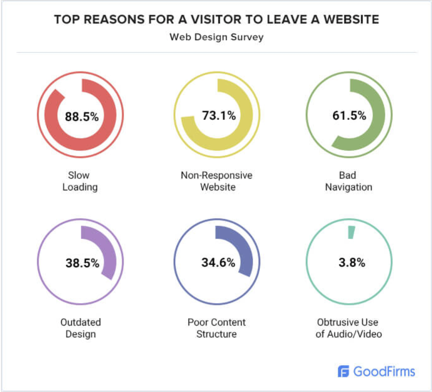
The faster pages load, the better experience the users will have, and slow load times are the number one reason why visitors exit a site.
Plus, Google rewards fast-loading sites with a rankings boost. In fact, page speed is a ranking factor on both desktop and mobile searches.
You can check the website’s page speed using Google PageSpeed Insights . Just enter the URL and Google will analyze the site’s speed, give you a score from 0 to 100, and some suggestions on how to improve it. Check the opportunities section at the end of the report for information.
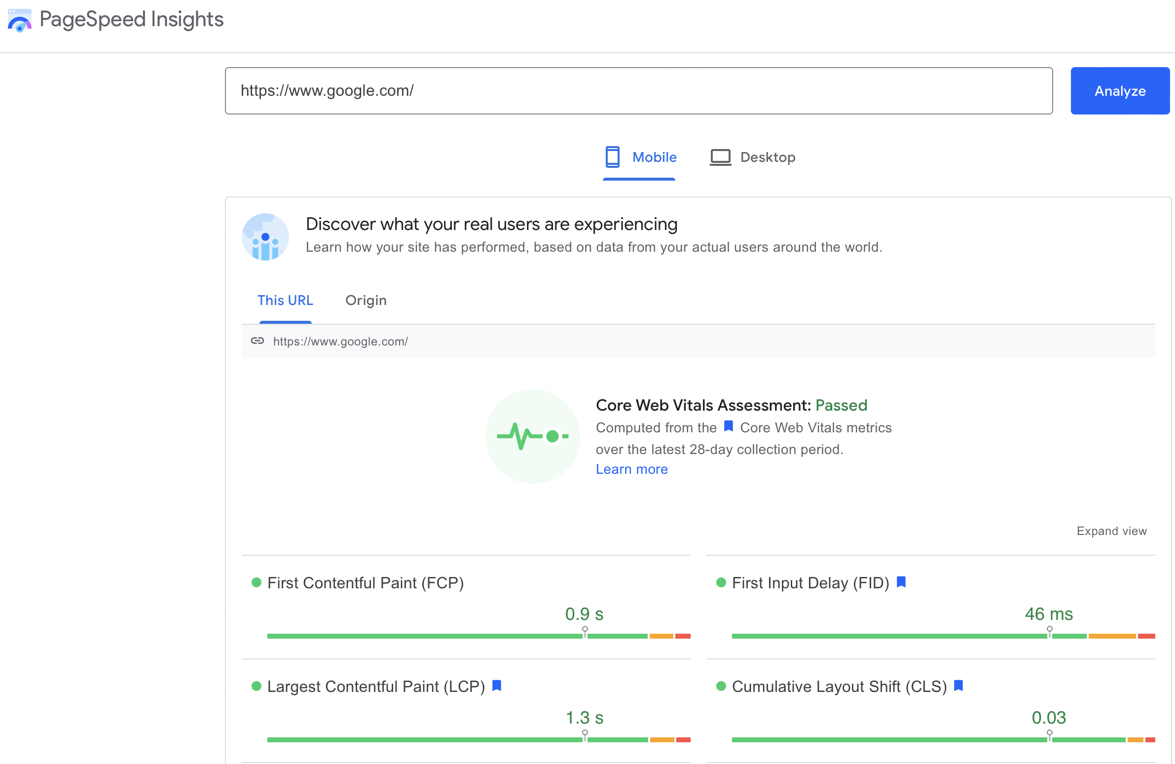
A good rule of thumb is for a website to load in less than three seconds. If it doesn’t, you run the risk of people exiting the client’s website before it can fully load. This will lead to a high bounce rate which Google takes as a bad sign and may consider the website low quality.
Even though 4G is fast and 5G is on the way, it’s still important to reduce the size of the mobile version of your site to facilitate fast mobile loading. You can also set up “accelerated mobile pages” for your website to load even faster using AMP.
3. Use Responsive Design
Responsive design is when a website automatically adjusts to fit the screen it’s being viewed on, whether that’s a desktop computer, a tablet, or a mobile phone.
It used to be that you would build a separate mobile version of a website that would be accessed by going to “m.yoursite.com.” However, this is no longer necessary as modern responsive design powered by CSS3 takes care of it for you.
Offering a single responsive design saves you time, money, and resources which means you can offer a better rate to prospective clients. It also keeps their website usable and looking good no matter what device people use to view it. A poorly optimized mobile web page can hide content, add an unnecessary horizontal navigation bar, and display text that’s too small to read.
Responsive design is more user-friendly, and it’s also better for SEO as you only have to maintain one website rather than two. When building out your client’s web pages, you don’t have to worry about things being stretched or squashed on different devices.
4. Focus on the User Experience
Another important factor in mobile optimization is user experience. Google wants to make sure that people who use their search engine have a positive experience and can find what they’re looking for easily.
A number one priority should be to make sure the website is accessible. This means people with disabilities should be able to use it without any problems. You can do this by using proper alt text for images, adding transcripts to videos , and using easy-to-read fonts.
Accessibility also means that you are optimized for languages other than English. Having a Spanish option for your website can help you reach more potential customers because Spanish is the second most common language spoken in the United States.
Try adding some pictures of the client’s business to their website to connect with potential customers. Adding photo effects with a tool like Picsart can help you create a better customer experience on mobile and optimize your pictures.
When you include calls to action (CTAs) on the website, make sure they are clear and not overused. A CTA is a button or link that tells users what you want them to do next.
For example, if you want them to buy a product, your CTA would say “Buy Now” or “Add to Cart.” Make sure the CTAs are visible and easy to find so people know what actions they can take on the client’s site.
The design of the website should be created to be thumb-friendly. Most people use their thumbs to control their phones, so people should be able to navigate the website easily with their thumbs. The buttons and links should be big enough to press without having to zoom in.
This can be a problem on websites that are not mobile-friendly as they often have small buttons that are hard to press. Another thing to keep in mind is font size. Make sure the text on the website is large enough to read. Ideally, customers shouldn’t have to zoom in on anything.
5. Be Careful of Advertisements
When optimizing a website for mobile, you need to be careful of advertisements. Google does not like it when websites have intrusive ads that interrupt the user experience.
This means you should avoid pop-ups, auto-playing videos, and anything else that might be considered annoying. If your client wants to have ads on their website, make sure they don’t obstruct the content of the webpage.
Before selecting an ad partner, check their reviews before onboarding onto their service. Many providers are Google Certified Publishing Partners , which means they have been vetted by Google.
Not to mention, if you showcase smart ads that allow retargeting, customers need to agree to cookies and the storage of personal data. Local businesses should be careful of zero-party data and what they are collecting.
Online companies need to adhere to strict regulations around customer data, including (General Data Protection Regulation in Europe), CCPA (California Consumer Privacy Act), and CASL (Canada’s Anti-Spam Legislation). Google is also planning to phase out third-party cookies support by 2023.
Companies will find it harder to acquire customer data from third parties or analyze user behaviors to collect them. In order to run effective marketing campaigns in the future, you will need to rely on customers willingly handing it over.
6. Use Local Keyword Optimization
Local businesses aren’t competing for the same high competition keywords as the dominating companies are. If you can rank number one for a keyword with a significant search volume, that’s great!
However, if for example, you’re a lawn care company in Wisconsin and those views are coming from a state on the other side of the country or overseas, that will not benefit you. Instead, the objective is to rank for ‘Lawn care Wisconsin’ rather than just ‘Lawn care,’ which should be much easier.
One way to identify local keywords is to think about what people might type into Google when looking for a local business. For example, if someone is looking for a pizza place, they might type in “pizza near me,” “pizza delivery,” or “pizza [your city].”
Another way to find local keywords is to use Google’s Keyword Planner . This tool lets you see how many people search for a particular keyword in a specific location.
 Source: TomsGuide
7. Move the Navigation Bar on Mobile
The navigation bar or menu is one of the most important elements of any website. It allows people to move around and find the information they’re looking for.
The navigation bar is usually at the top of the page on a desktop. However, on a mobile device, the navigation bar can be moved to the bottom of the screen. This is because it’s easier to reach the bottom of the screen than the top. Most people hold their phones with one hand and use their thumb to navigate. This can make it difficult to reach the top of the page.
By moving the navigation bar to the bottom, you’re making it easier for people to use your website. In fact, Apple has recently made this change to their Safari browser.
Make sure the buttons on the navigation bar are large enough to be pressed with a thumb. You should also consider using icons instead of text to make the buttons easier to understand.
8. Optimize Title Tags and Meta Descriptions for Mobile
Since the title tags and meta description show up in search results, they need to be attention-grabbing. SEO meta descriptions, in particular, need to be optimized for mobile instead of desktop. As we mentioned earlier, 64% of searches happen on mobile devices, so that’s where your focus should be.
One way to do this is to keep the titles short and to the point (maximum 60 characters). Try to include the focus keyword, but keep the title easy to read for a general audience.
The meta description also needs to be readable on a small screen. Write punchy meta descriptions that hook the user quickly; Google will only display the first 160 characters.
Conclusion
Optimizing a website for mobile is essential for local businesses to succeed in the future. With more and more people using their phones to search the internet, it’s important to make sure their website is easy to use on a small screen.
If you want to optimize a client’s website for mobile, follow the tips in this article. From optimizing the title and meta description to making sure your navigation bar is easy to use, these tips will help you create a perfect website for mobile users.