


We’re incredibly proud of the significant updates we’ve made to the BrightLocal brand, so I thought I’d share with you, dear reader, the story of how we got here.
Before we begin, you’ll want to know why it was time for a brand refresh. Take a look below at how the BrightLocal brand has changed incrementally over the years.
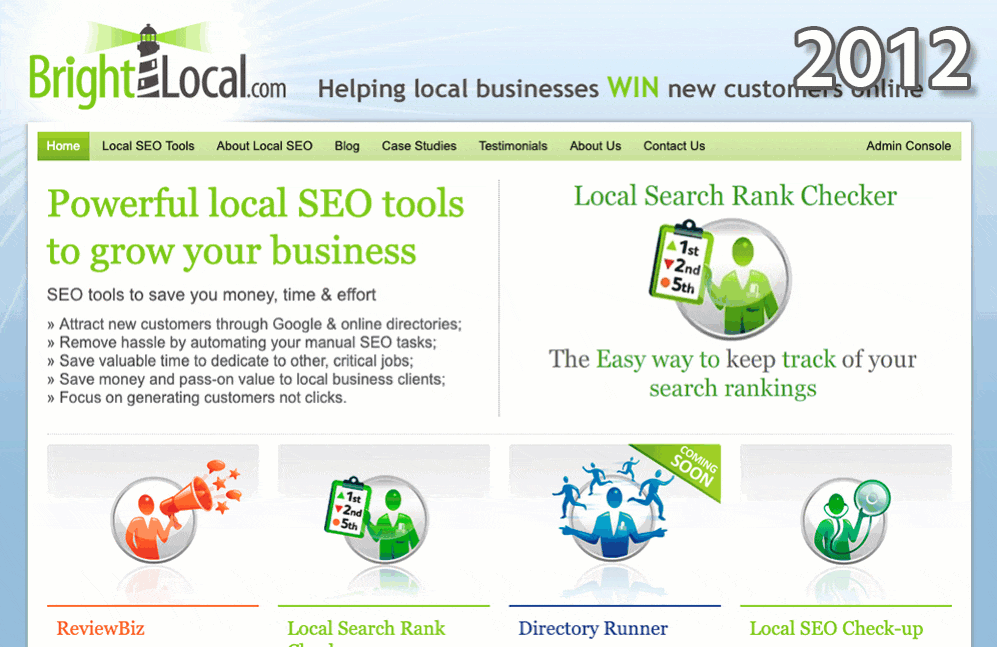
You’ll notice that 2019’s website and brand is (perhaps apart from the shift from 2012-2013) the biggest change we’ve ever made to our online identity, and it was a long time coming.
But believe me when I tell you: it was never meant to be this way.
Flashback to May 2018…
BrightLocal brand stakeholders are cloistered around post-its and pens. Scattered across the large table are half-formed thoughts, big ideas, and bold directions. On the screen a presentation containing the meticulously-planned agenda rolls out, slide by slide.
What do we want from the BrightLocal refresh? We know we need some lighter colors and a new logo, but that’s about it.
So we’re here to decide the scope of the project, and to look in detail at the size of the job ahead of us. But as ideas get bigger and bigger, and we realize that this is an opportunity to completely update BrightLocal’s online presence to better reflect the size and ambitions of the company, the agenda goes completely out the window.
Before we know it, we’re writing new slogans, we’re planning entirely new sections of the site, we’re arguing passionately over the top-level navigation.
After a gruelling day of creativity and excitement, we emerge into the hot spring sun, giddy with anticipation. In just a few months, we’ll have a brand new site to share with the world!
Little did we know, we’d just birthed a BLOB. And the BLOB was hungry…
The BLOB
Before you undertake a sizeable project, you need a project name, right? You can’t go around saying “How are we getting on with the BrightLocal brand refresh project?” all day. So, for the first of many times in this story, we relied on democracy.
We asked the BrightLocal UK office to share and suggest their project names, put them up on a board and asked the office to vote on their favorites. Here’s a shot of the board just as voting begun:
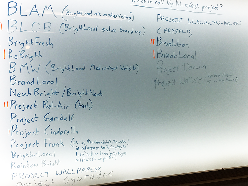
(If you want to understand the reasoning behind some of these name suggestions, I’m happy to do my best to help in the comments below!)
In the end, BLOB (an acronym for BrightLocal Online Branding) won out. It was (at least at first) fun to say, it was short and snappy, and it meant something.
But we had no idea how apt that name was. This BLOB was going to grow and grow.
A Bright Idea
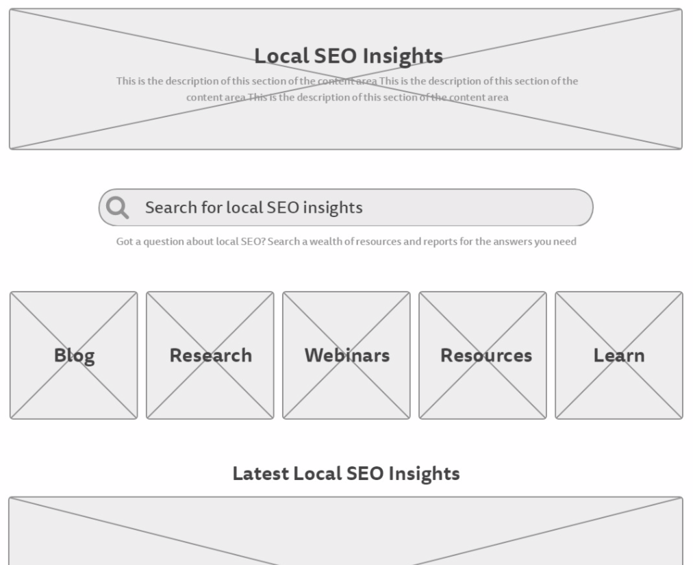
The part I, as Head of Content, personally had the biggest stake in was what we eventually decided to call ‘Bright Ideas’. For years, BrightLocal had been building up an awesome archive of respected research, expert commentary, and useful resources, but the link to it was relegated to the very bottom-right of the website footer, under the particularly modest heading ‘Blog’.
So it fell to me to plan and wireframe a whole new section for this content, in order to make it more accessible, attractive, and searchable. Here’s my first attempt at a wireframe (I’m no web designer but it was good to give this a shot):
Meanwhile, in the Design Lab…
While I was planning Bright Ideas, our graphic designers were busy at work developing countless (as in ‘I gave up counting’) experiments for the new BrightLocal icon.
Our previous logo was purely text and we felt the addition of an icon would give our branding flexibility. The icon needed to stand alone and still be recognisable as part of the BrightLocal brand. It needed to communicate what our company stands for and the value we deliver to our customers.
Here’s a gif showing just a few of the icons designed during this experimentation phase:
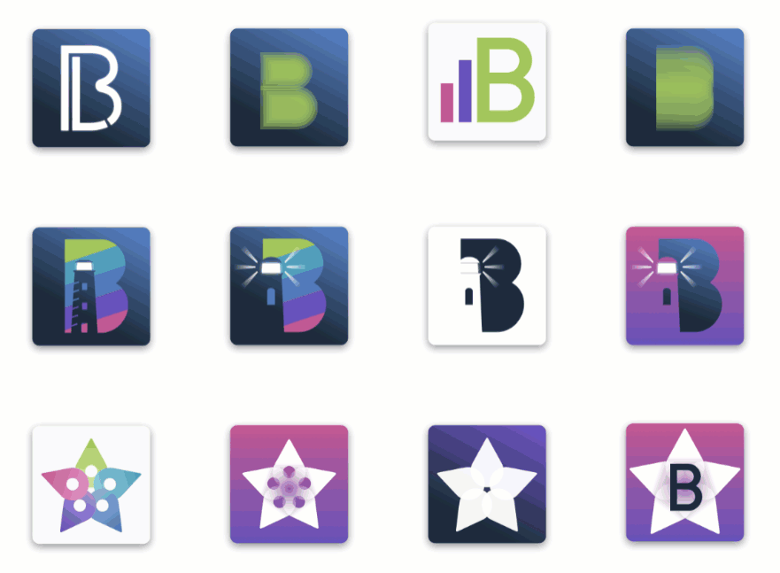
Out of this phase came five very different icons (and a new logo font, too). Again, we took the best ones and allowed the team to vote on their favorites, explaining why they made their choices to inform further design.
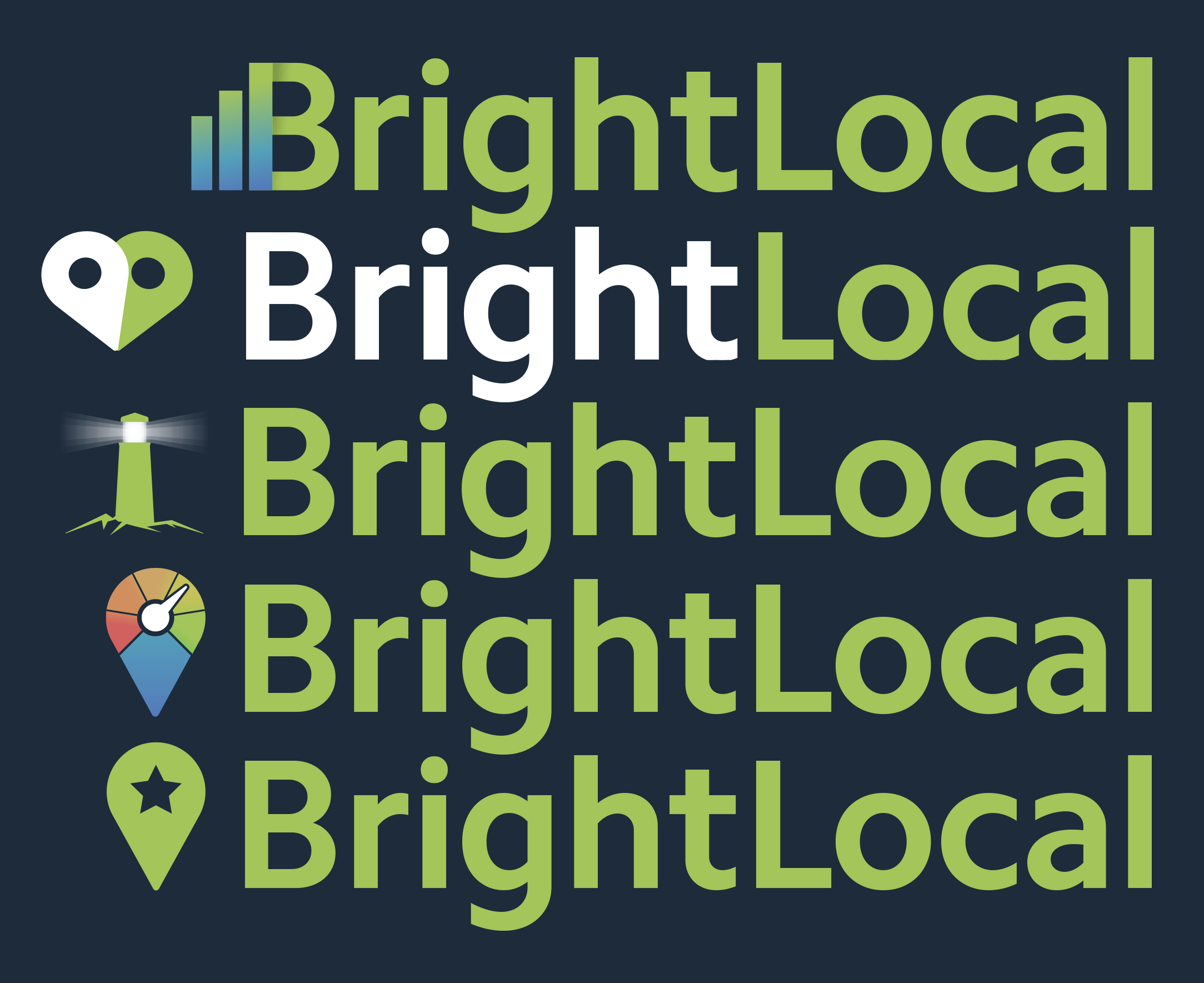
However, concerned that we were voting in a vacuum, we decided to put the four most popular logos to the people who matter most: our customers.
In the first stage, we ran user-testing sessions with an early draft of the new design and branding. This was a really valuable way to not only get detailed feedback on the work we’d done so far, but to breathe a sigh of relief after hearing that plenty of it was positive.
Next, we put four distinct designs on a private page of our website and offered BrightLocal customers the chance to vote on their favorite via the tool itself.
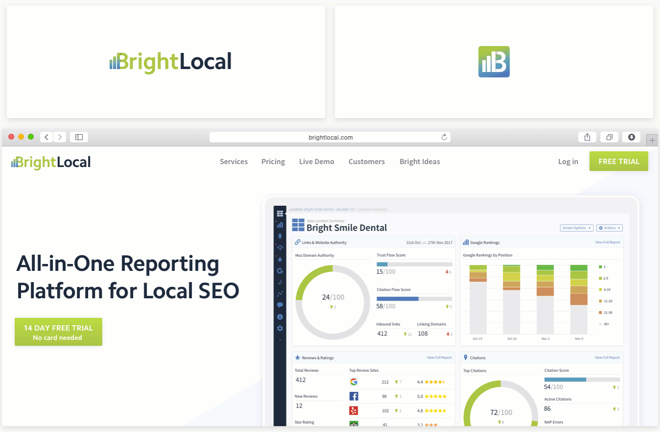
While by no means unanimous, the winner was fairly clear and actually matched up with the design we preferred internally. And so the BrightLocal ‘Heart Pin’ was crowned Lord of the Logos!
A few more tweaks to the icon (which we’ve also heard referred to as an owl and a wingnut) and we were done.
![]()
But elsewhere we were Very Much Not Done. Remember I told you that this BLOB grew…
Phases 2-15
With a new logo and color scheme in place (which took a reasonably respectable three months from start to finish), you’d think we were in a good position to re-skin the website, right? Well, no.
Fact is, we were so happy with what came out of the design phase that we realized we needed to modernize the entire site to match the quality of the new branding.
As with any sizeable website over time, some pages had lost a bit of their lustre and information had become out of date, so we pulled out our magnifying glasses and combed every single page of the site for out-of-date info, images that used the old branding, and opportunities to revitalize and refresh the content.
Here’s a selection of updates from the giant list of improvements we made to the site once the design was ready:
- New animations showcasing each tool
- Completely rewritten copy better highlighting benefits and uses
- Updated video explainers
- Brand new imagery throughout the site
- New functionality for comments
- Reorganized top-level navigation and footer
- New URL structures for product pages and Bright Ideas content
- Updated favicon to match the new logo
- Bug fixing and site testing
- And that’s not even including the actual site build itself
While our team of tool developers focused on the stuff that makes our customers happy, a whole bunch of us were faced with diving into the above while delivering other, more critical projects.
But we rolled our sleeves up, took a sip of dangerously strong coffee, and cracked on with it.
Eight months later and were were finally swapping the coffee for champagne…
To celebrate 10 years of BrightLocal, we’re excited to announce a new look, a new website, and lots more besides! ?
Take a look at what’s new: https://t.co/IwlaOOcQZ3#BrighterLocal pic.twitter.com/HohehZ6WJF
— BrightLocal (@bright_local) April 9, 2019
The End?
While this story has a very happy ending, and we’ve been overwhelmed by the support and positive reactions around the rebrand, it’s worth noting that we’ve still got plenty of tweaks and improvements planned.
In the meantime, here’s to not doing this again for at least another five years…