


As some of you may have noticed over the last few months, BrightLocal has undergone some visual upgrades (including the color scheme update that went live in our toolset today). These surface changes are more than just about looking good—they are the result of a year-long project looking into how we could improve our brand to enhance user experience.
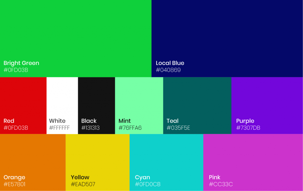
As part of the project, we looked at many aspects of our brand (more on those below), including color. Color plays such an important role across the BrightLocal brand, presenting actionable insights and information, and allowing customers to gain understanding quickly.
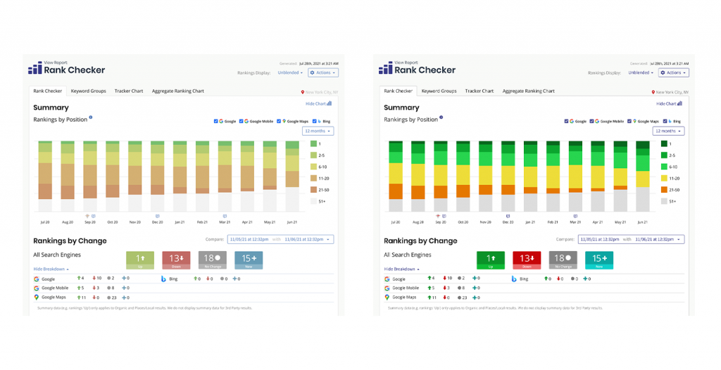
Looking at the BrightLocal palette, it was immediately apparent that information was sometimes hard to read. When we also discovered that 1 in 12 men and 1 in 200 women suffer from Color Vision Deficiency, we started researching how we could combine color and information to enhance user experience for all of our customers.
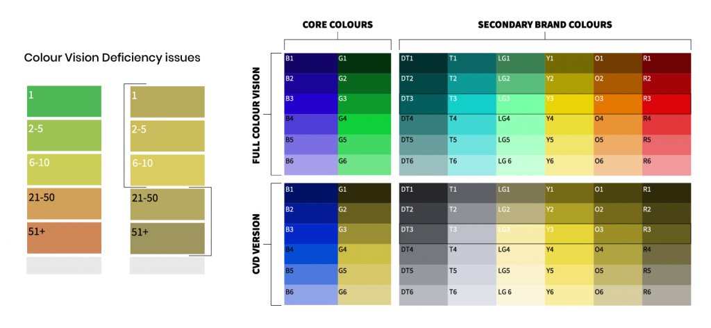
The result is an entirely new color palette that makes data and insights easier to understand, helping you to quickly pinpoint what’s important.
The BrightLocal Brand Project
The BrightLocal brand project wasn’t about starting from scratch, but about building on top of what we have to take the BrightLocal brand forward, and this meant staying true to our core values. The first step was to pop the hood and focus on three key areas:
- Reflect on who we are as a company.
- Build consistency across the BrightLocal brand.
- Improve the overall customer experience.
Before designing anything, it was essential that we spoke to a range of customers to discover how they perceive our brand. Good or bad, it was important to get a solid understanding.

Along with talking to customers, we spoke with members of the BrightLocal team. Through holding workshops and discovery sessions, we worked towards a clear internal and external understanding. There was a lot to unpack, but eventually we gained confidence from our insights and set about translating this into visual design.
Brand Elements
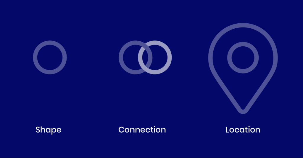
Although a simple shape, we discovered that the circle has a variety of meanings when it comes to local SEO. These meanings include representing connection, unity, community, and the humble search pin.
Logo
Although a logo isn’t the most important part of any brand, it’s arguably the most seen part of a brand.
The BrightLocal logo has gone through some changes over the years. This time we decided to drop the uppercase and retain the well-known heart pin, giving our logo a welcoming and personal feel.
![]()
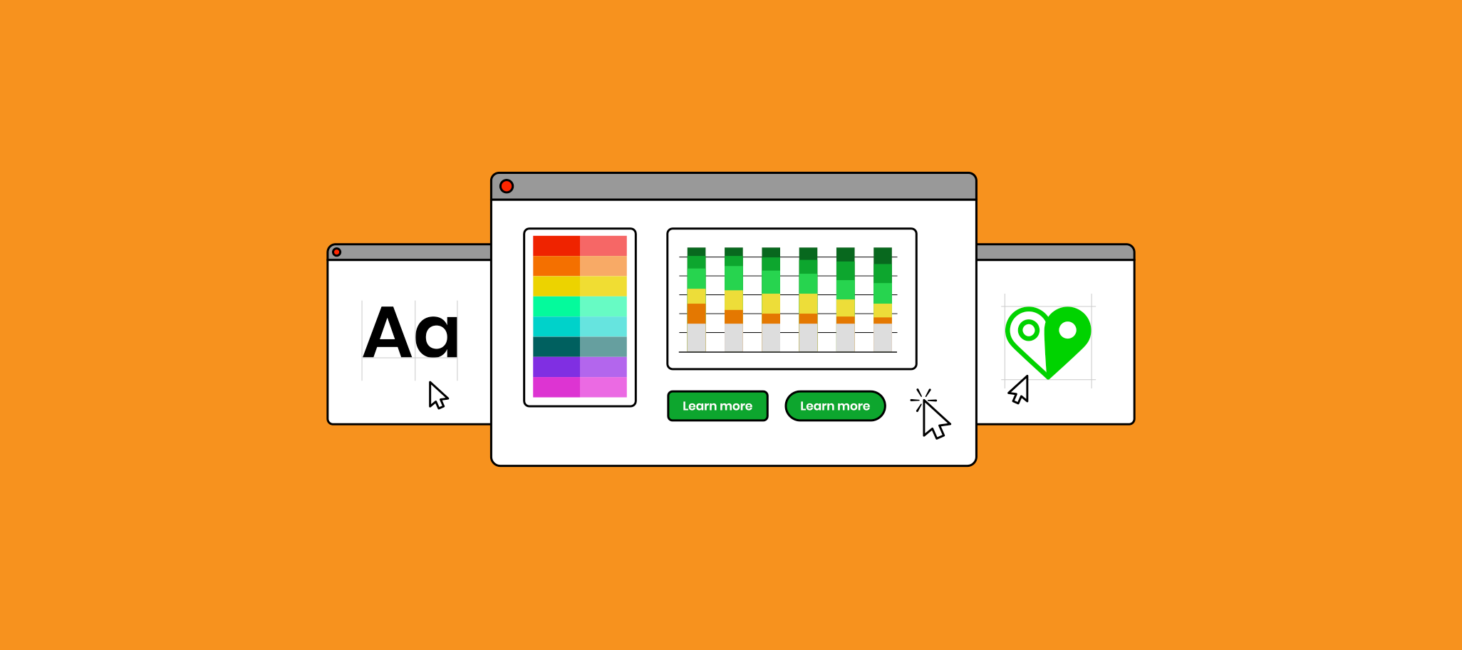
Brighter Ideas
When talking with our customers, we discovered that being friendly and personal were two areas that they strongly associated with BrightLocal. These attributes lent themselves to creating a new and unique illustration style, which is more bold, playful, and eye-catching than our previous illustration style.
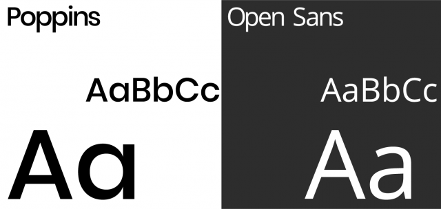
Font/Typefaces
We discovered that our previous typefaces could sometimes be hard to read at smaller sizes, meaning that customers struggled to grasp insights quickly. Our new typefaces are much better suited for digital platforms and will hopefully help customers to easily understand information. It’s not all about function though, and our headline font is also popping with personality.
Summary
This project had three clear objectives and although we like to think we’ve accomplished these goals, this is by no means the end. Improving our customer experience is an area we’re constantly working on and consistency is a key part of how we deliver this.
We’re proud of the BrightLocal brand and hopefully this has given you some insight into our process.