


You’ve probably noticed that things look a little different around here. That’s because we’ve just launched our new brand identity!
Taking our brand forward
We’re big believers in the power of brand, which is why we’ve continued to invest in ours over the years.
We’re confident that we have one of the most recognized and trusted brands in local SEO, but as with everything we do, we’re not going to rest on our laurels. We have a restless nature that urges us to always question what could be improved and how we can do things better.
This isn’t the first time we’ve refreshed our brand. After all, we exist in an industry that is constantly evolving. Sitting still is not an option.
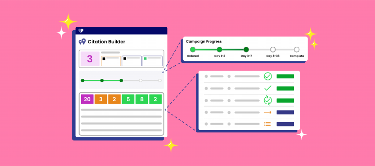
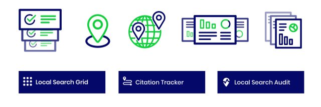
Our business is constantly evolving, too. In the years since we last refreshed our brand identity, we’ve welcomed over 70 new faces to the BrightLocal team and expanded our offering with Local Search Grid, Showcase Reviews, BrightLocal Academy, Local RankFlux, and much more.
Whereas previous rebrands have mainly been motivated by the need for a visual refresh to reflect changing design trends, this time we’ve gone much deeper and asked ourselves to really think about who we are, who we’re here for, and what’s important for our customers to know about us.
So without further delay, let me guide you through the new BrightLocal brand identity.
No change of heart
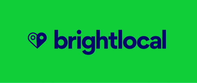
Our logo has undergone a subtle change. It’s an evolution more than a revolution because, quite frankly, we really liked our logo!
![]()
The ‘Heart Pin’ is one of the most recognizable and iconic aspects of our identity. It proudly displays our love of all things local and communicates the importance of teamwork, community and generosity within the business.
It’s also the symbol of our monthly team awards, The Big Heart Awards, where we recognize the team members who have done exceptionally amazing work and gone above and beyond for their colleagues and/or customers. Each month, BrightLocal makes a donation to a charity that’s important to the winners. Since the launch of the awards last year, we’ve donated $10,000 to 24 charities.
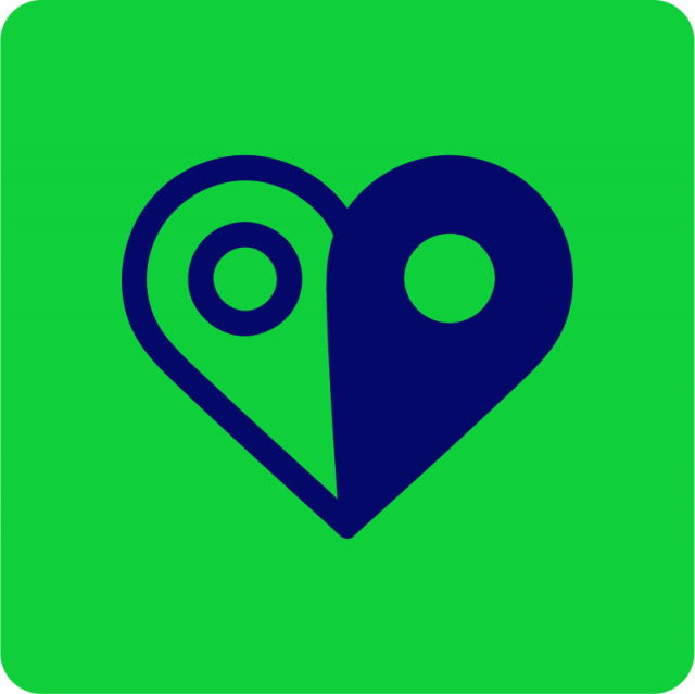
It was a no-brainer to keep the ‘Heart Pin’ sitting proudly within our logo.
The text in the logo is now lowercase, and the eagle-eyed amongst you will notice the font type has changed. The lowercase text is less formal and more approachable, which better reflects our welcoming culture.
While the logotype is changing to be lowercase, rest assured we’re not changing the company name formatting. Everywhere else, we’re still good old ‘BrightLocal’, with the capital B and the capital L.
Color me impressed
Color was a major area we wanted to look at. Over the years, our color palette has expanded considerably, so it was important for us to question the role that color was playing within our identity.
We’ve used color to distinguish between different products within our platform. We also slightly diverted from our palette when creating the identities for BrightLocal Academy and BrightLocal Agency Directory. It’s fair to say we had had a lot of colors competing for attention!
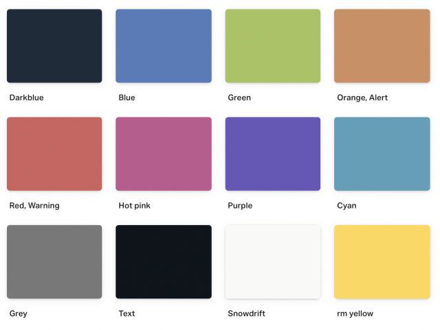
Our old primary colors
When it came down to it, there were two colors that we felt were most strongly associated with BrightLocal: green and blue. So while we still needed a variety of colors to paint with, green and blue needed to be leaned on more heavily, and elevated within our identity.
Beyond having too many competing colors, our previous palette felt too muted. After all, half of our company name is ‘bright’, and these colours were definitely not that. We like to think we’re a bold and vibrant bunch, and we wanted colors to reflect that.
I won’t go deep into color theory here, even though it’s a fascinating topic. Instead let me introduce you to our core brand colors: Bright Green and Local Blue.

Our new core colors
Our core colors needed to stand alone and work in a variety of different contexts. And importantly, they also needed to work together.
We also have new secondary colors, which complement our core colors and create a more harmonious palette.
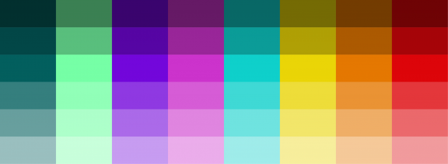
Our new secondary colors
Color isn’t just about making a statement—accessibility was a big part of the decision-making process. We want our website and platform to be accessible to as many people as possible. Around 1 in 12 men and 1 in 200 women suffer from “red-green” color vision deficiency, which makes it hard for them to distinguish between shades of red, yellow, and green. That’s a lot of people who might have been finding it difficult to use certain parts of our website and platform.
Many accessibility issues have been resolved with our new palette, but there are some things we’re still working on. Over the coming months, we’ll be updating many of the charts in the BrightLocal platform to ensure the great insights included are instantly obvious to many more customers.
Just our type
Accessibility also informed our new typefaces, which you’ll now see across our website and platform.
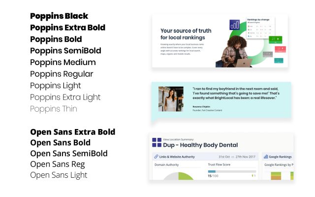
These typefaces are easier to read at any size, which allows them to work perfectly in any context—whether that’s making a long-form article easier to digest, helping our website copy sing, making it quicker to navigate our website and platform, or ensuring an important notification doesn’t get missed.
Picture perfect
We’ve been a little guilty of relying on tried-and-tested illustration styles. If we’re honest, we were getting a bit tired of seeing the same whimsical, long-limbed people that are living rent-free on every SaaS website under the sun. It was time to get a style we can call our own.
We explored a number of different approaches, and in the end we landed on two that would work in a variety of contexts.
Photography
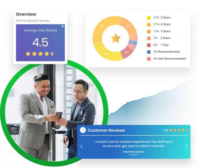
Photography is the perfect medium for celebrating the people who make BrightLocal what it is—whether that’s our team, our amazing customers, or the broader local SEO community.
We chose a photography style that is dynamic, real-to life, and shows the impact that BrightLocal has on our customers’ working lives. We also wanted to ensure our photography represented and celebrated the diversity within the local SEO community.
And this is just the start! We want to celebrate even more of our amazing customers, so if you’re interested in getting featured on our website with a testimonial, drop us an email.
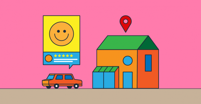
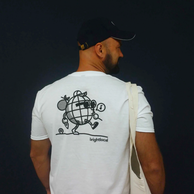
Illustrations
Illustrations were still going to be key within our visual identity, particularly in Bright Ideas, our content hub for everything local SEO. Our amazingly talented Visual Designer, Ken Iizuka, explored various styles that would help elevate our content and one stood out as the clear winner. The style is vibrant, playful, and offers a lot of flexibility to reflect the variety of topics we cover.
You’ll start to see these custom illustrations appearing on Bright Ideas, which itself has been fully redesigned with better readability and new-and-improved search functionality.
Consistency is king
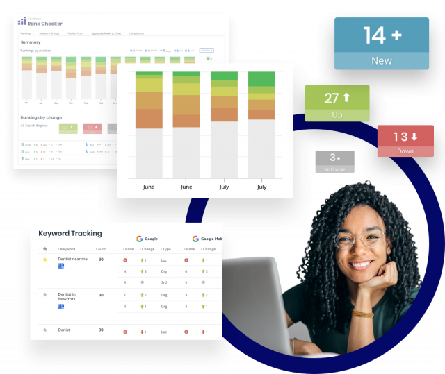
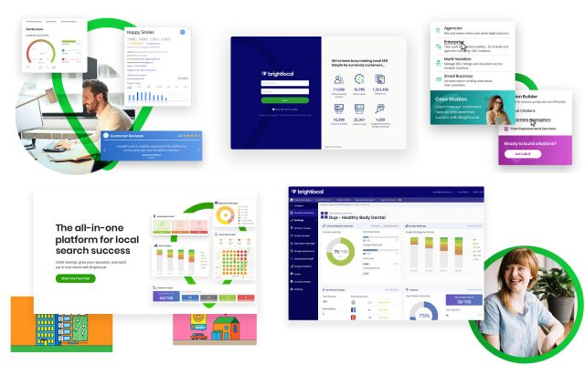
Over the years, our visual identity had become slightly disjointed. That’s understandable. Things had been created at different times by different designers who all suffered from a lack of defined brand guidelines. The visual disparity between our website and platform was the most stark example of this.
Our old brand touchpoints
But there were also inconsistencies playing out at a much smaller scale. A full brand audit revealed a vast spread of styles being used across our icons.
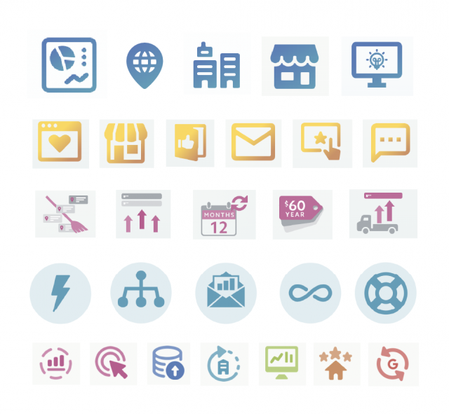
Our old icons
Our brand plays out across multiple touchpoints: there are big hitters like our website and platform, but there’s also email, social media, video, our podcast, presentation decks, and so on.
So when we approached tackling the rebrand, we were adamant that this wouldn’t be isolated to our marketing website—every inch of BrightLocal was going to be scrutinized.
Bringing consistency to such a broad set of touchpoints is a major undertaking, and there are still a few things to tackle, but today when you use our website and platform, you’ll be treated to a more visually-aligned experience.
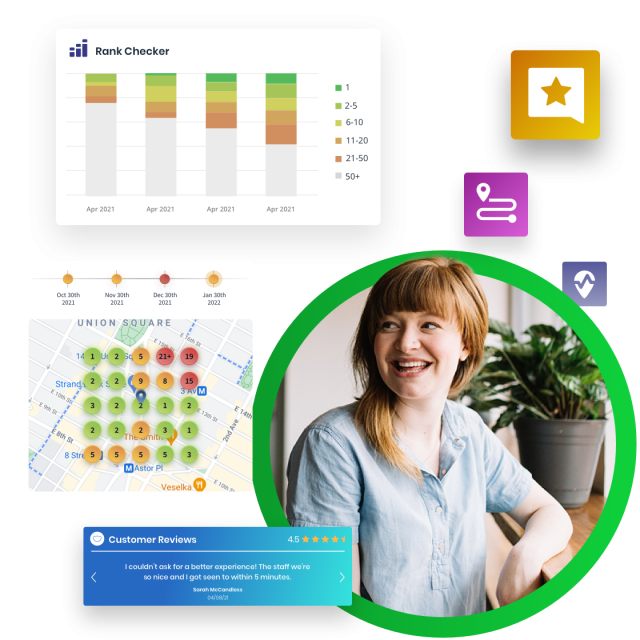
Our new brand touchpoints
Even the smallest of icons are now singing from the same hymn sheet.
Celebrating our culture
A big part of this rebrand is the launch of our employee brand.
Our people are key to our success, and bringing awesome new people into the business is obviously a huge part of that.
However, if you came to our website before today, you wouldn’t know much about what it’s like to work at BrightLocal (spoiler: it’s awesome), and you wouldn’t have been able to see the exciting opportunities to join the team (we’re hiring btw).
So we’ve changed that with our ‘Working at BrightLocal’ careers page, where you can learn more about our culture, what life at BrightLocal is like, and browse our open vacancies.
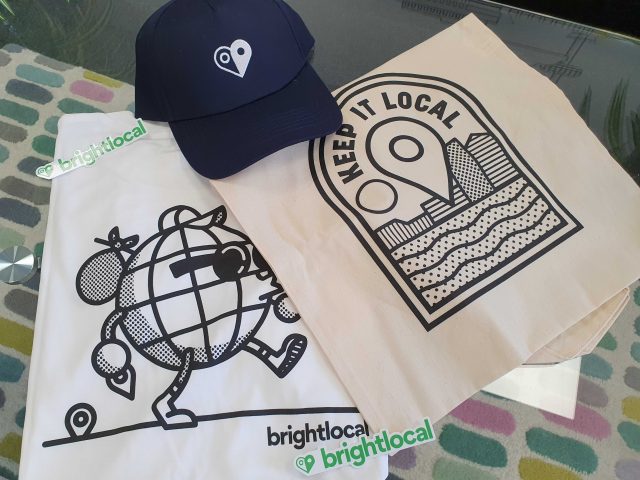
Show me the swag!
No rebrand would be complete without some swag, right?
Here’s some of the team modeling our latest swag.
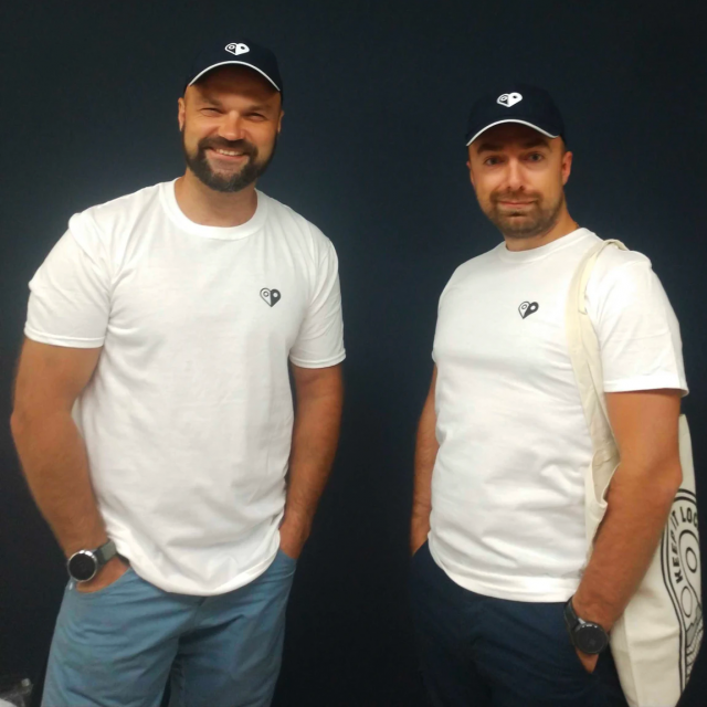
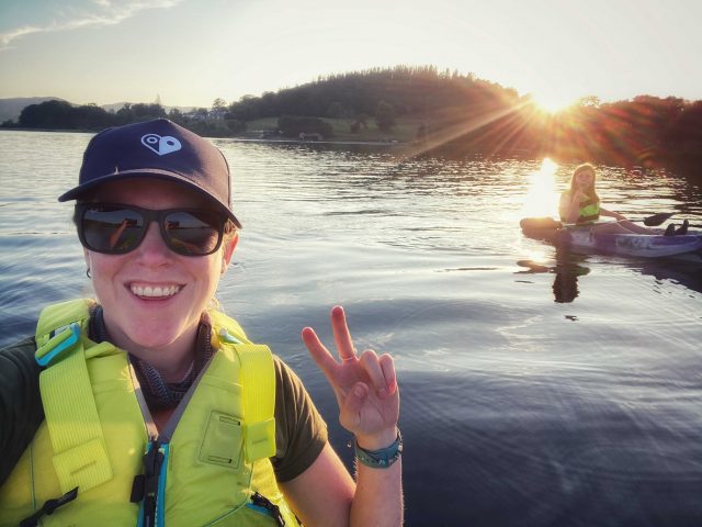
It would be cruel to show you these highly desirable items without giving you the chance to get your hands on them. And you can do just that, by entering our sweepstake to win one of twenty BrightLocal goody bags.
Just head on over to our Twitter, LinkedIn, or Facebook and interact with the competition post for your chance to win your very own BrightLocal t-shirt, cap, tote bag, and sticker!
A BrighterLocal
So that’s it for the tour. We really hope you like our new look.
Under the hood, we’re still the same BrightLocal, but we’re confident that our new brand will do a much better job of showing off who we really are.
Even though things look a little different now, you can still find everything on our website and platform in the same place as it was before.
Over time, we’ll be making further visual updates within the platform, such as improving the accessibility of our charts, and we’ll be sure to let you know when these changes are happening and, importantly, why.
If you want to learn more about the process behind our rebrand and see more of what’s changed, look out for our in-depth overview coming soon.
A thank you to the team
Every part of our rebrand was handled by our internal team, so I’d like to finish off by saying a massive ‘thank you’ to the people behind it.
Dom, our Lead Designer, was the driving force behind this rebrand. He undertook a huge amount of research to ensure we really got to the core of what our brand should stand for, and you’ll be able to read about that soon.
Ash made the rebrand a reality on our website. This wasn’t just a case of simply updating some CSS; our website was feeling the strain of technical debt and Ash rebuilt the site to ensure it’s running faster than ever.
Ken only joined the team earlier this year, but he quickly got to work developing illustrative styles to bring a playful and memorable look to our identity.
Inzi and Yurko handled all user interface updates within the platform to ensure our ambitions for a consistent brand identity was fully realized at launch.
This was a big team effort and many more people played a part in getting get us here today. Thanks to everyone for your commitment and passion.
So… how do we look?
We’d love to hear your feedback on our new brand identity. Head to the comments to let us know what you think, and don’t forget to enter the sweepstake for your chance to win a BrightLocal goodie bag.